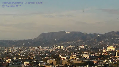
Sometimes I find myself in unique locations. Last year in December I was at the Bonaventure Hotel in downtown Los Angeles. This is a very special place. Presidents stay there when in town. As fortune would have it I wound up on the top floor of the hotel. Around 32 floors high. There's a revolving restaurant at this level that offers great panoramic views of the city. I took a few phone photos while I had the chance and would like to feature them here.
This is the view from the Bonaventure's revolving restaurant. Takes around an hour for the floor to make a complete rotation.
Here's what downtown LA looks like from there...
This is the tallest building in Los Angeles...
Here's what the street looks like at its base...
This is the view towards Hollywood...
Here's a zoomed in shot of Hollywood. You can make out the sign on the hill. The light colored structure towards the right of the sign is the Griffith Observatory. On the other side of the hill is the city of Burbank.


6 comments:
Nice photos Charles. Say did you ever make model sheets for the characters for the Crash games, because im finding it difficult to know how the characters should look and be shade. I've been finding resources of your concept work turning it in to a height chart for making my sculpture work I've reworked some of the characters they look proper. https://plus.google.com/u/0/photos/photo/115341033999203497010/6395316466627496610?icm=false
Wow! Your going everywhere in world! 32 feet high hotel? I'm good on the soild ground, haha. The interior of the time restaurant looks gorgeous! LA looks like a busy place just by looking at those pictures! You must had a good time there!
Hello Charles! ¨
Wow! Great pictures! Quite a difference to what we have here in my small island. :)
Best regards!
Your fan,
Albert Miiros
Vanilla Latte and Albert - Thank you and yes it was fun being there. A rare opportunity.
Hazman - I did some model sheets but not many. They weren't pushing for that as much as I think they should have. The budget was tight I guess. In any case you did a good job lining up the characters. Looks about right to me.
Thanks! It's very help full coming from you. Hmmm that's interesting by what you mean as in tight budget. was it due to art resources or game development? Also did you and Joe Pearson get to decide the colours for the characters. Or was it Naughty Dog's decision? Because I do know Naughty Dog wanted Crash to be orange so he wooden blend in to the environment. so yeah its a bit unfortunate that Naughty Dog weren't asking more from you. I think you tell from there slight inconsistency. Hope Im not bothering you with these constant Crash questions.
Hi Hazman. By tight budget I mean there wasn't a lot of money for what they wanted us to do. We could have done more if the budget was bigger. Joe Pearson and his lawyer negotiated the deal. I went along with what they came up with. We got into some color. Mostly in establishing the look of the backgrounds. I made some suggestions for Willy the Wombat character colors I think. Also for the cover of the first game. Otherwise color was mostly handled by Naughty Dog.
Post a Comment