
The Art of Charles Zembillas daily blog.
Friday, November 30, 2012

Thursday, November 29, 2012
Crash Nitro Kart - Road to Velo - part 7
Here he is! Emperor Velo from Crash Nitro Kart in his glory from 2002. This is the concept sketch that nailed the character followed by the rotation drawings I came up with for the modelers at Vicarious Visions.

Nope, he doesn't have four arms as you see in the front and back views. What I did was something a bit unorthodox. Since he wore a cape I wanted to show how it draped over his body with his arms at his side. The extended arm position is a standard pose for rotations when the character is to be modeled for CG animation. Combining the relaxed arm pose helped define the look of the Velo as he would normally appear.


Wednesday, November 28, 2012
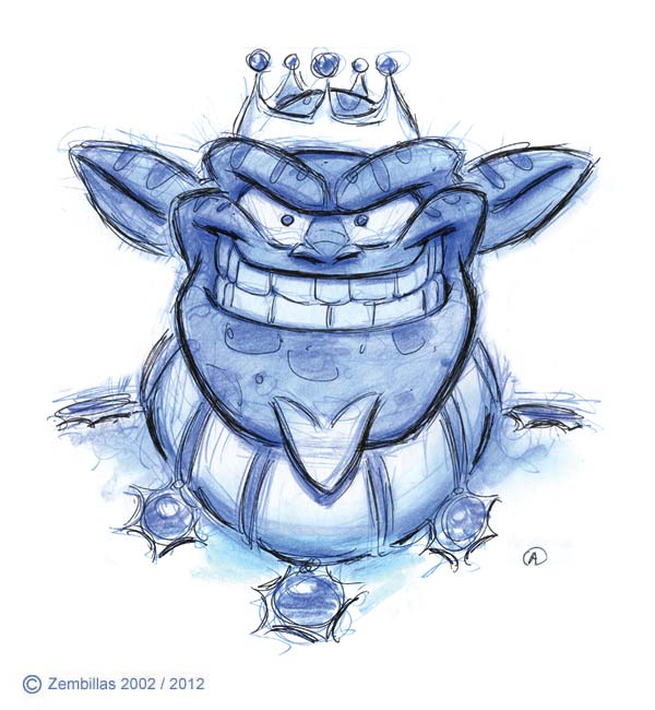
Well dressed rodent
I love to paint and I had a good time coming up with this subject back in 2003 as a class demonstration in visual development. Sketched in pencil on watercolor board I used acrylics to bring out the color for a fun character. Kind of an old school gangster in the Chicago style. I kept the image simple and used a classic technique in bringing out form by laying down transparent tones in a monochromatic wash and then following up with heavier applications of pigment. You can see the layers in the emergence of the image.

Tuesday, November 27, 2012
Animation Day 2
Here's something else from when I was creating odds and ends art in relation to Animation Day. A phase I was engaged in whereby I wanted to encourage unity among artists and turn April 1 of each year into a holiday. This is from 2007 the result of a class demonstration at Cal State Northridge. I drew each element separately and combined them in Photoshop. The distant background tone along with the archers and also the title scroll and lettering.

Saturday, November 24, 2012
Oldy - Give it some life
Here's another sentimental favorite that I forgot I had. From the same sketch book as the one I mentioned two entries ago. At the time I was taping older drawings on some pages. This one was done in 1884 while working on the second season of He-Man. There were times when I felt stifled and creatively frustrated and would release the energy I had in doodles on breaks. This was done with graphite and several Col-erase pencils and also some white-out on the highlights of the face. I punched the color up slightly as it's faded a little over the years. Great fun finding these drawings!

Friday, November 23, 2012
Crash in color
A few days ago on November 12 my blog entry was a picture of Crash I came up with which I intended on painting in a traditional medium like acrylics. I wound up using Photoshop instead. This is how it turned out earlier today. Keep the petition going!
Follow this link to the Bring Back Bandicoot Petition
Here's a link to Bring Back Bandicoot on Facebook.

Wednesday, November 21, 2012
Oldy but Goody
Hi everyone. I've been working on a project that I plan to launch early next year in January 2013. I recalled that there was some concept work I created for the project a long time ago but couldn't find it anywhere. Then I remembered that it could've been in a sketch book I kept. The search was on and I found the scketchbook. Indeed the material I was looking for was there I'm happy to say. And to my astonishment there was much more.
I discovered a time capsule of art I forgot that I had done. Some of them going back to my earliest days working in animation. Here's an example of what I found. Perhaps the oldest drawing in the book. It was created in 1982 when I was working at Filmation Studios. There was a period between the time I was hired and the start of the original He-Man series where I was in the studio's development department working on ideas for new cartoons. One of my concepts was a cat and mouse idea inspired by Tom and Jerry but not Tom and Jerry. This is the drawing I did for that idea.
It was folded and pressed between the pages of the sketchbook. Drawn in blue pencil on animation paper that was taped together cuz I got carried away and drew too big. I scanned the image without any retouch so you can see it in its actual state. For me personally it's a real treat to have found this again and the experience is adding to my creative enthusiasm as of late. Hope you enjoy it. Click on the image for a better view.

Tuesday, November 20, 2012
Animation Day 1
Hello everyone. I'm working on my next project which I'm excited about. I plan on debuting it in January 2013. Meanwhile I was looking through my archives for something colorful and I found this. It's from 2007. At the time I was promoting the concept of Animation Day within the community. I felt that April 1 of each year should be a special day for animation and artists should declare it a holiday. This is one of several images I created to that effect for another industry centric site I maintain called AnimationNation. Straight up Photoshop trying to evoke early disco in the 1970s. Something different. There's a series of images related to Animation Day which I'll be showing in days ahead.

Sunday, November 18, 2012
Jak and Daxter history - The Road to Jak - Part 12
Between my last post on the development of Jak and the images you see here there were more designs that I came up with along the lines of this version. I'm skipping over them for the most part because this is what I wound up with as far as my last pass on working up the character that would be Jak. It was the best of this group. You can also see that as I progressed I included side and back views of the design to assist modelers and to give the principles at Naughty Dog a better idea of how the character looked with dimension.


At this point Naughty Dog took over while I went to exploring the many other characters that would comprise the project. When I saw Jak next it was the final version they came up with based upon the direction this path had taken assimilated with elements I was coming up with designs other than Jak. The one big difference in this case being the hairdo in the final version which was derivative of Dragonball Z. That did not come from me. By the second Jak game his hair style went back more towards what you see above. Most of what I did on J&D was conceptual trailer blazing intended to give the artists at Naughty Dog a foundation for the project. Some of my designs were used much more literally as is the case with Daxter. I'll be showcasing this aspect of the game's development next in future entries.
Saturday, November 17, 2012
Original Crash Bandicoot Character Rotation
Check this out Crash fans! Behold! Look what I discovered today! This my friends is the original five pose character rotation for Crash Bandicoot! Yes indeed! The authentic one and only rotation ever created for Crash back when he was Willy the Wombat in early 1995. The date on one of these poses is February 1995. And all the drawing except for the 3/4 front view are the actual artwork and not a photocopy.
Rotations are a standard necessity in animation production for character designs. This is what I did for Willy/Crash using the 3/4 front view as a starting pose. The drawing is based upon a clean up I did of the sketch Naughty Dog sanctioned as the official look of the character. The images were used to create the CG model of the first Crash. They're primal in the creation of the final version of the character in his earliest days.
This is the first time these images have been seen by anyone since the very beginning of Crash and the first time they've been published as far as I know. Hope you enjoy them!


Friday, November 16, 2012
Cuteness
Time for some color and cute little buggers and birds. I came up with these guys as class demonstrations around 2002 while teaching Visual Development at my school The Animation Academy in Burbank. I subsequently published them in our schedule for the following semester and got a boost in enrollment as a result. When I asked the new students why they joined us many of them said it was because of these characters confirming what I learned from experience. Cuteness sells. Painted with watercolor and gouache on a pencil sketch.

Thursday, November 15, 2012
Two phase concept
Last week while class was in session and winding down I started a sketch that intrigued me. There wasn't enough time to go further with it so I scanned the drawing as it was. I picked it up earlier today and continued to work the image. Here are the two phases in comparison. The initial drawing as a doodle and the finished blue line sketch. It's interesting how the feel of a character can develop from the first scribbles to the final rendering. As always this was an enjoyable experience creating with my students.


Tuesday, November 13, 2012
Crash Nitro Kart - Road to Velo - part 6
Continuing with the saga of reaching a final design for Emperor Velo from Crash Nitro Kart in 2002. At this point in the character's development Vicarious Visions had focused their attention on one of the previous concept sketches I created. When things get to this point and a decision is made as to the look of the character the process becomes a matter of refinement. That's the case with these three drawings as we started to bear down on Velo.


Monday, November 12, 2012
Come Back Crash
A few days ago I was getting another Crash sketch ready. This time I drew Crash on Strathmore paper which is heavier than regular drawing paper and suitable for painting with watercolors or acrylics. This is what I came up with initially.

I intended to paint the image and started with inking a final line in prep for color. Then I got busy and the distractions pulled me away but at least I got this far and with luck I'll be able to finish it either with acrylics or in Photoshop.

Then I got to thinking about the Bring Back Bandicoot campaign and something came to mind. Instead of including "Bring Back Crash" text along with the image as I usually do how about changing it to "Come Back Crash". It has a different connotation. "Bring Back" makes it an appeal. "Come Back" makes it more of an encouragement. Something that can supplement the Bring Back with a Crash Comeback some day.

Saturday, November 10, 2012
Waiting for color
This is a class demonstration from a couple of weeks ago. Drawn in blue pencil on Strathmore paper which is suitable for painting. My intent was to do just that. Get out some acrylics and give her color. Unfortunately time didn't allow me to get that far during the session so for the time being she's waiting.

Thursday, November 08, 2012
The day's doodles
When a window opens to get a little drawing in I take advantage of it especially in class. The first image came about as a result of a demo on how to construct a generic male figure in the advanced character design class I teach. The red line represents the initial sketch. The blue line suggests areas that can enhance the exaggeration of the design to create a more powerful form. It's followed by something inspired by my students while they worked on their assignments.


Tuesday, November 06, 2012
Dragon head studies
Hello everyone! Back in the saddle again here in Burbank. Thanks very much for visiting while I was on the road. Here's something I started in class before I left and continued upon my return at last night's session at the Academy. The subject is a dragon I designed back in my illustration class in art school. I showed the original painting to my students and thought to redraw the head to see how I would handle it today. Used a black line ball point pen. Not so much a demo as it was drawing with students while they worked. Good practice.


Subscribe to:
Posts (Atom)