Monday, March 04, 2013

Blue Fairy of a different kind

Last week in the Visual Development class at my school I had the chance to create a fun demonstration. One of my students suggested that I come up with a fairy so I did. I started with a soft lead graphite pencil and sketched out the concept. Next I went straight to a fine point black line pen and committed to the image.


This evening I picked up the drawing and worked it to another level by shading it with blue pencil as an example of how to handle tonal values and enhance the composition.


This was great fun. I enjoyed coming up with this little gal. Maybe we'll see her again someday. 

Saturday, March 02, 2013

J&K - The Road to Daxter - Part 6

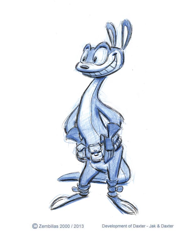
There comes a time in the design development of a character where after many attempts to define the look you get to the point where you know you nailed it. That's what you see in this group of core drawings that became the final version of Daxter from "Jak and Daxter". Created in 2000 the consensus from Naughty Dog centered upon one of the designs I came up with in the extended process of developing Big D. The first image is from a concept sketch showing this particular design from the side and back. You can see what it was based upon by referring to my previous entry about the subject. The following drawings came about once it was decided that this was the way he would look. Daxter was the first character ND won an award for. It occurred at the Game Developers Conference in San Jose California in 2002. Daxter won Best Original Character.


Friday, March 01, 2013

Cute in pencil cute in color

I had fun this week coming up with some new art. I doodled this in class while drawing with my students. Keep thinking about a concept based upon this approach for a series of characters. I drew this fellow with graphite pencil. When I was finished I scanned the image and gave it a dose of color in Photoshop. 


Thursday, February 28, 2013

Early Skeletor production drawing 1983

This is for the He-Man fans out there. I have a large volume of unpublished works from the original He-Man TV series from the 1980s and She-Ra as well. I'll be feeding more images as often as I can. Here's something to share. I'm not sure which episode it's from but it dates to early 1983 and is among the very first production drawings every created of Skeletor. I thought it was from "The Cosmic Comet" episode of He-Man but I don't think that's the case. If someone out there recognizes this from a first season He-Man cartoon they've seen I'd appreciate it if they could place it within a historical context. You have the power. ;)

Wednesday, February 27, 2013

Another Mona Lisa

Hi everyone. It's been very busy lately and although I intend to update my blog daily sometimes with so many things going I fall a little behind. Let's get back on track.

You may recall back on January 5 of  this year my entry was a Photoshop illustration of a woman based upon a popular song from 1950 by Nat King Cole called Mona Lisa. I created a few different images along that theme. This is another version from that time in my early days of learning and experimenting with Photoshop. I scanned a blue pencil drawing and used it as a base for a color illustration. I stayed within one local color and played upon the value or tonal relationships to get the desired atmospheric affect. An easy and efficient method for moving into color if you're not sure what to do or how to proceed.

Sunday, February 24, 2013

Last project for Rhythm & Hues 2008

If you watched tonight's Academy Awards this evening you would have seen that the Oscar was given to "Life of Pi" which was the work of a studio by the name of Rhythm & Hues. A major FX house for Hollywood who had won Oscars before. They declared bankruptcy the other day and this has thrown a big spotlight on the problems within that sector of motion picture production. I did several projects for R&H back in the mid 1990s about the time I was working on Crash and Spyro. My first project with them was the movie "Mouse Hunt".

I  came up with these drawings on August 10, 2008. They were in a tight spot and needed some character concept designs for an insulin commercial that was happening. I don't know what happened with the project but the designs I did for them are here for all to see. I created these on a Sunday and the work was delivered by the start of the next day to begin their week. 

This was fun. I liked the characters and the nature of the challenge. I attempted to develop an array of safe and encouraging characters with lots of charm for individuals who suffer from diabetes. Here's my contribution to the last R&H project I was involved with...


Saturday, February 23, 2013

Crash Bandicoot t-shirt design 1997

I find things from Crash that I came up with while working on the games from back in the day. Here's another example. This was for a t-shirt design that Naughty Dog asked me to come up with while on Crash 2 in 1997. It's a concept sketch of Crash as a fireball streaking towards the ground...


This is another version that incorporated different positioning on his legs...


This is a quick doodle I created to show how the design would look on a t-shirt...


Lastly here's the final line drawing of Crash for the t-shirt. I don't know if it was ever printed. From what I recall this was not something that was going to be sold. It was for the ND crew and others close to the production.


Enjoy this vintage Bandicoot artwork Crash fans!

Friday, February 22, 2013

Creature in acrylics

It's been a long time since I had the opportunity to so some good ol' fashion painting and I got a chance to do it this evening as a demonstration for the Visual Development class at my school. Whipped out the acrylics and my artillery of brushes and some watercolor board and got busy. Within an hour or perhaps 90 minutes I completed this composition.


I explained to my students that with today's digital illustration technology you can get something started traditionally and finish it off in Photoshop if it needs further touches or adjustments. I took advantage of my own advice and tinted the image to give it some further color sophistication and knock back some of the intensity and accentuate the highlights. Here's the final result.


While the demo was in progress one of my students took photos of the painting in different stages of completion. Here's what it looked like going backwards in time. Thanks Joel!


Before any rendering took place and prior to the commitment to paint I worked out my composition as a free form doodle on a notepad to be sure I knew what I was aiming for visually.


And that's the story behind today's entry! Hope this inspires other artists to get back to basics every once in a while and keep those analog chops up.

Thursday, February 21, 2013

Gray to color with markers and Photoshop

Last week I had a chance to create a quick demo for a student in need of some direction in my Visual Development class at the Academy. He was emerging into the gray scale rendering aspect of the course. I place a strong emphasis on understanding how gray tonal values work in relationship to color.

I began with a drawing in blue pencil followed by black line pen. The I added the gray tones with markers.


Once the analog work was done I digitized the image and brought it into Photoshop to enhance the grays through tints.


Finally I made use of color tints to bring additional life and interest to the subject. Really made a difference!


A simple black line and gray marker sketch becomes more interesting when a digital approach is added to the process. Try it sometime and see what this technique can do for your art.

Tuesday, February 19, 2013

Blue pencil head study

It was in 2005 while conducting a class at the Burbank Adult School that I came up with this image as a demonstration. In was an exhibition in the versatility of Col-erase blue pencils which is a traditionally staple medium in animation. It's pliable and can be used in several different ways. The technique I used here involved drawing the composition followed by a combination of smudging with blending and line drawing. To    complement the effect I used an eraser to pick out areas where light would be cast upon the subject. If you're an artist that uses a pliable medium for drawing try it some time and see the results you get.